Wagoneer — Design System.
Wagoneer — Design System.
Ad units and a design system for the launch of the new Grand Wagoneer — starting with brand research, exploring accessible type and color, and ending in a system every discipline could use.
Unidades publicitarias y un design system para el lanzamiento del nuevo Grand Wagoneer: desde la investigación de marca y la exploración de tipografía y color accesibles, hasta un sistema que cualquier disciplina pudiera usar.
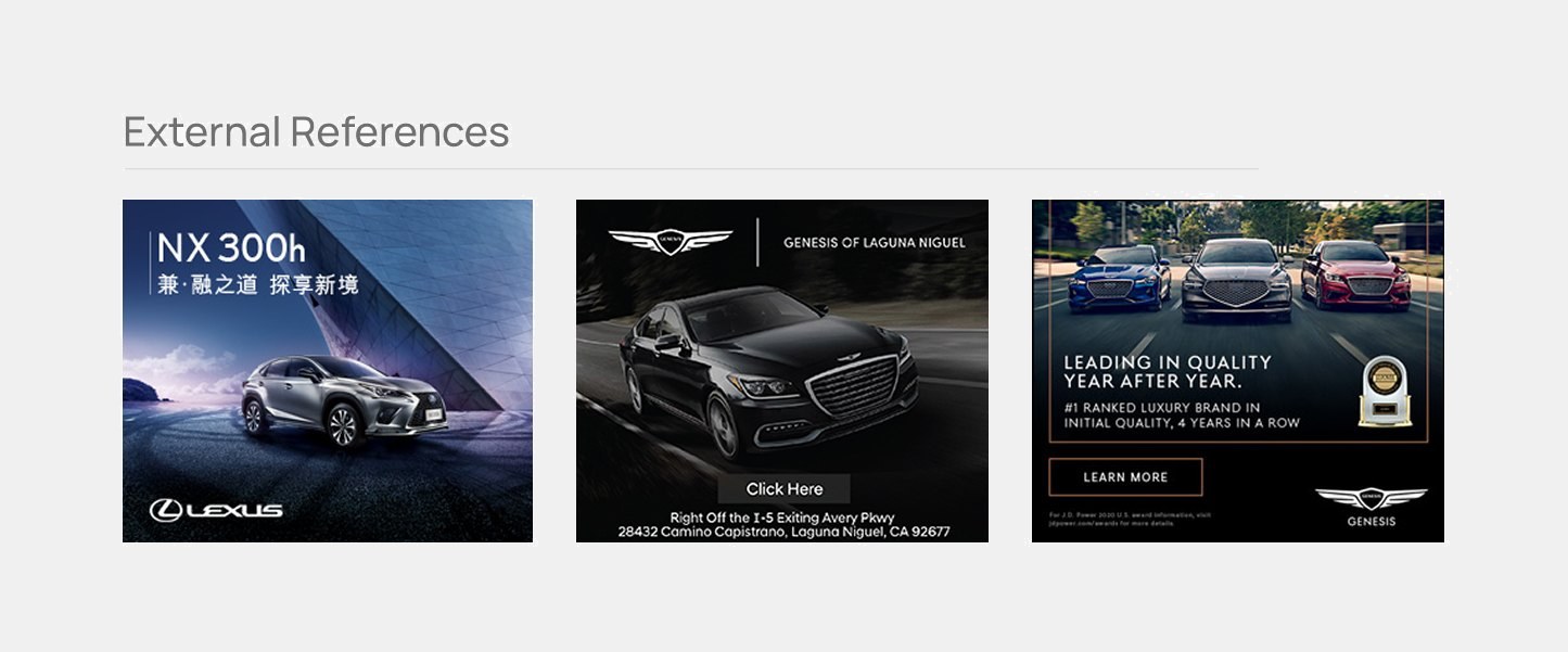
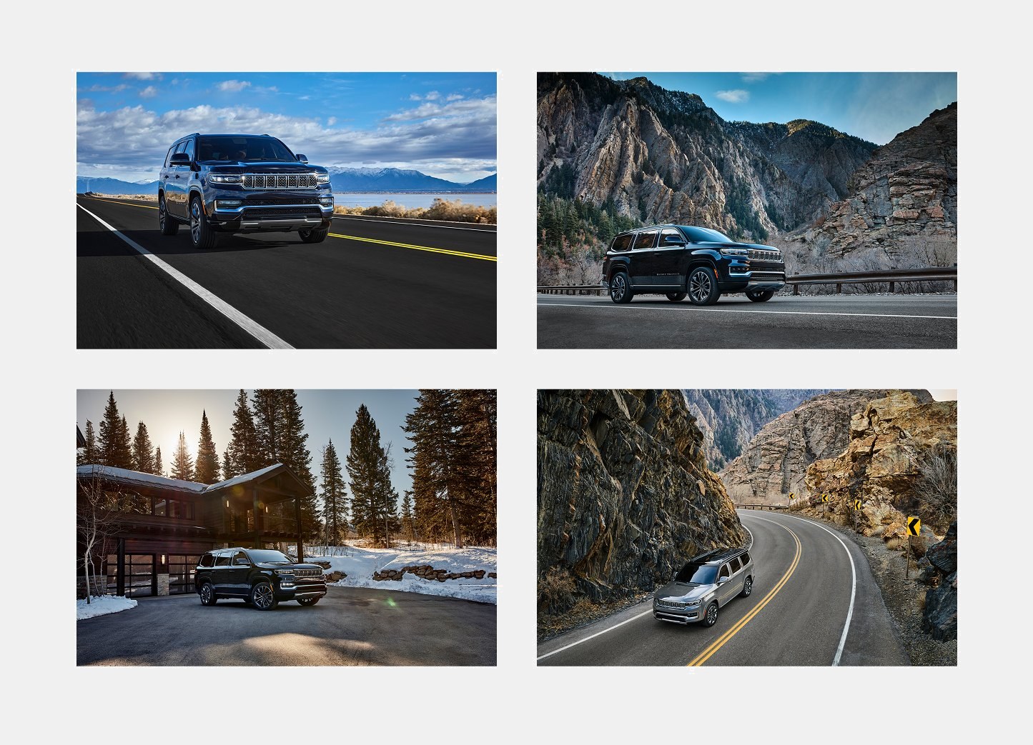
A premium SUV launch needed ad units that felt luxurious — dark imagery, serif type, gold accents — while staying legible and accessible at tiny banner sizes.
Un lanzamiento de SUV premium necesitaba unidades que se sintieran lujosas —imágenes oscuras, tipografía serif, acentos dorados— sin perder legibilidad ni accesibilidad en tamaños de banner muy pequeños.
- Brand research to understand the nature of the new Wagoneer.Investigación de marca para entender la esencia del nuevo Wagoneer.
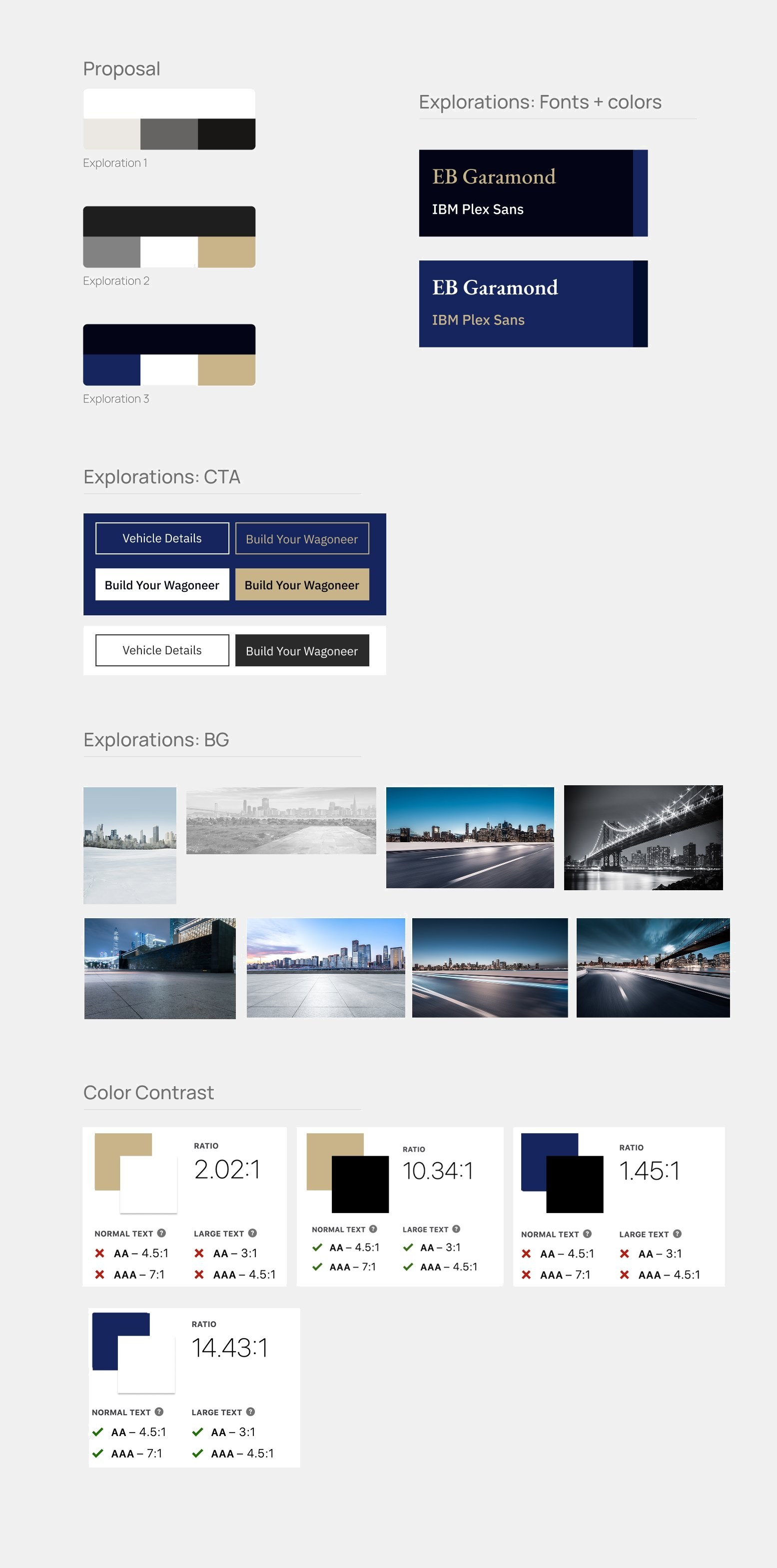
- Unit proposals with accessibility first: font pairings and CTA explorations tested against WCAG contrast ratios.Propuestas de unidades con la accesibilidad primero: combinaciones tipográficas y exploraciones de CTA validadas contra ratios de contraste WCAG.
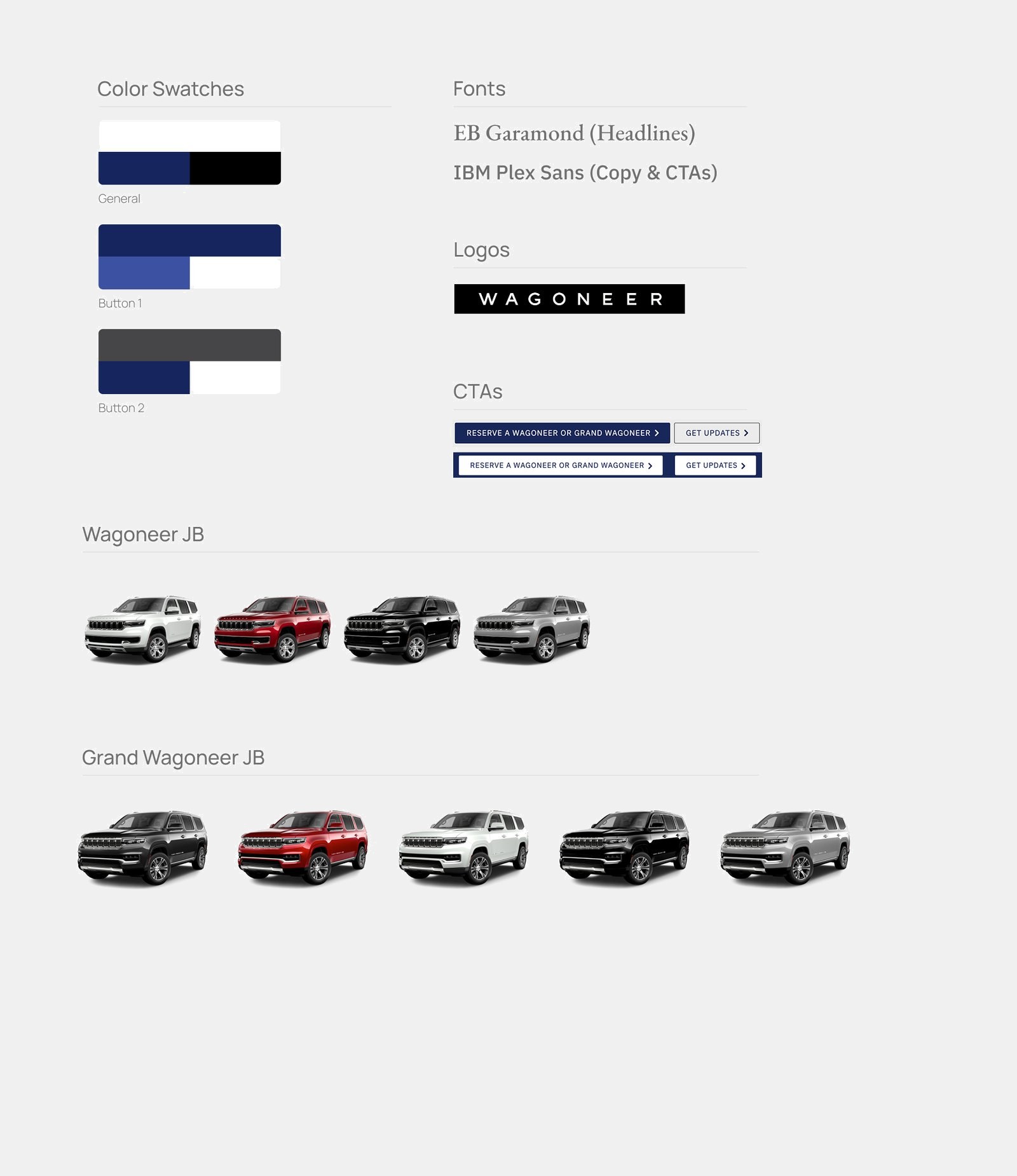
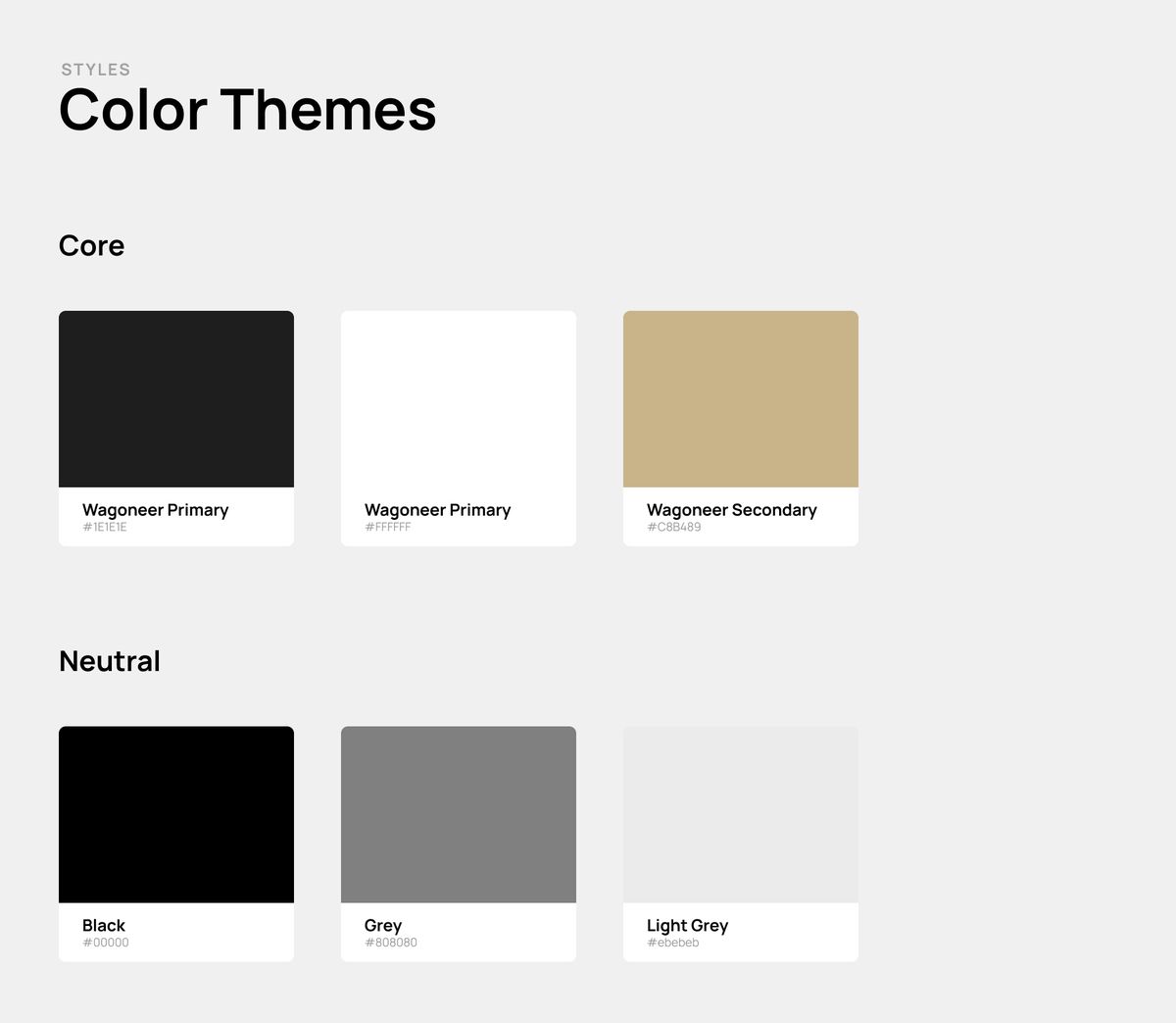
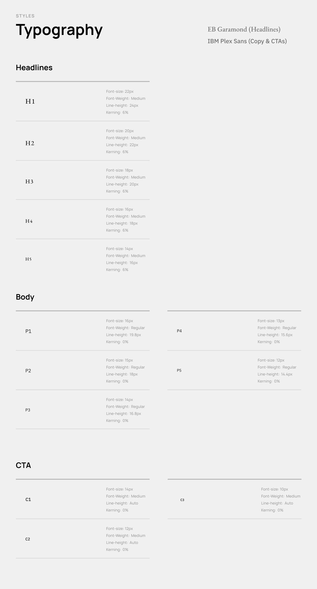
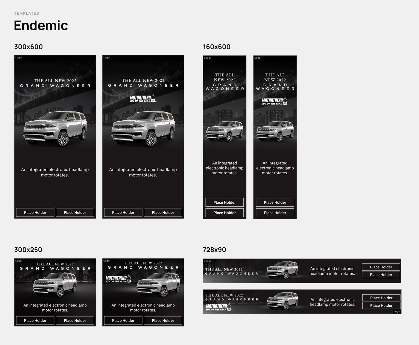
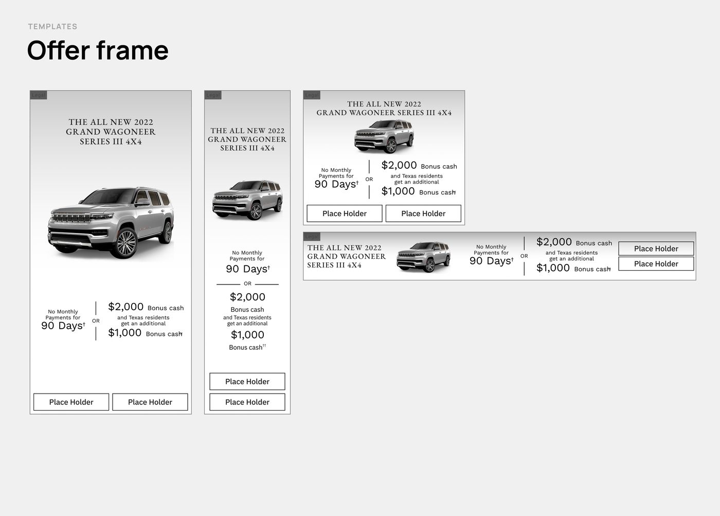
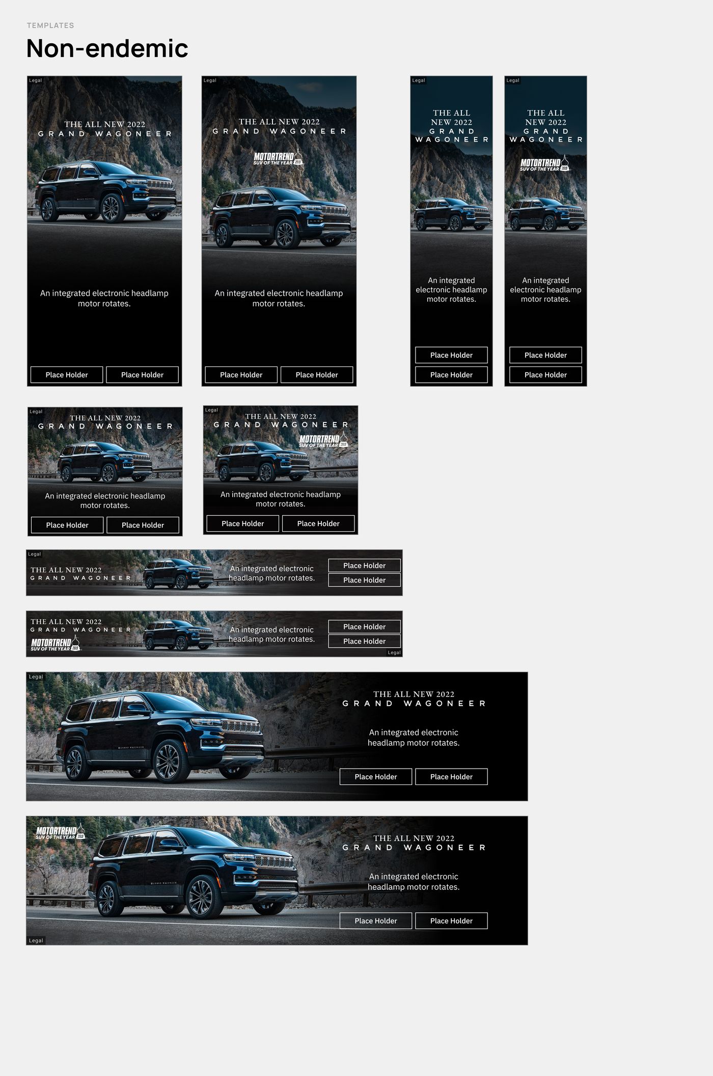
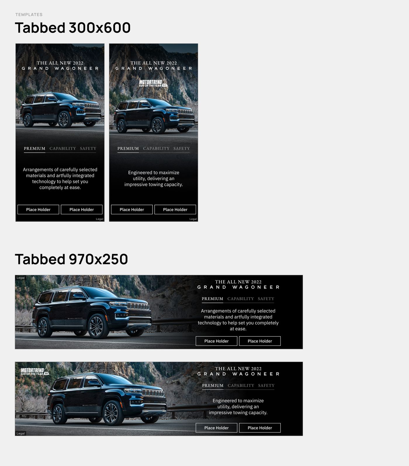
- Design system for an interdisciplinary team: color and type foundations plus templates across all tiers and sizes (Default, Endemic, Non‑endemic, Tabbed, Offer).Design system para un equipo interdisciplinario: fundamentos de color y tipografía, y templates para todos los tiers y tamaños (Default, Endemic, Non‑endemic, Tabbed, Offer).
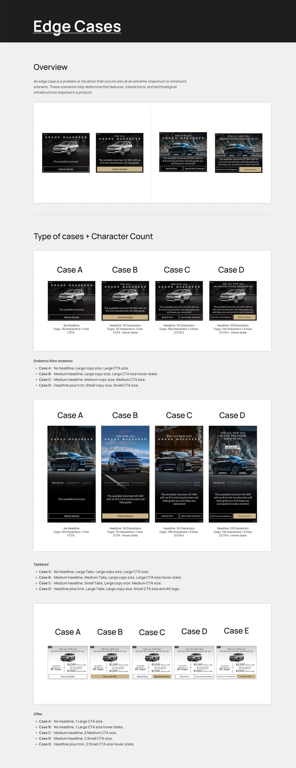
- Documentation with template overviews, edge cases by character count and unit measurements for every size.Documentación con resumen de templates, casos borde según conteo de caracteres y medidas de cada tamaño de unidad.
Luxury that stays legible
Lujo que se puede leer
The brand called for dark imagery, serif type and gold accents — a combination that easily fails at banner sizes. Before designing the units we tested every color and type pairing against WCAG: gold only works with black text, and navy only with white.
La marca pedía imágenes oscuras, tipografía serif y acentos dorados, una combinación que falla fácilmente en tamaños de banner. Antes de diseñar las unidades validamos cada combinación de color y tipografía contra WCAG: el dorado solo funciona con texto negro y el azul marino solo con texto blanco.
Those pairs became rules of the system, and I presented the process and this accessibility research to the client together with the proposals.
Esos pares se volvieron reglas del sistema, y presenté al cliente el proceso y esta investigación de accesibilidad junto con las propuestas.
Exploration
Exploración
Foundations
Fundamentos
Templates
Templates
Documentation
Documentación
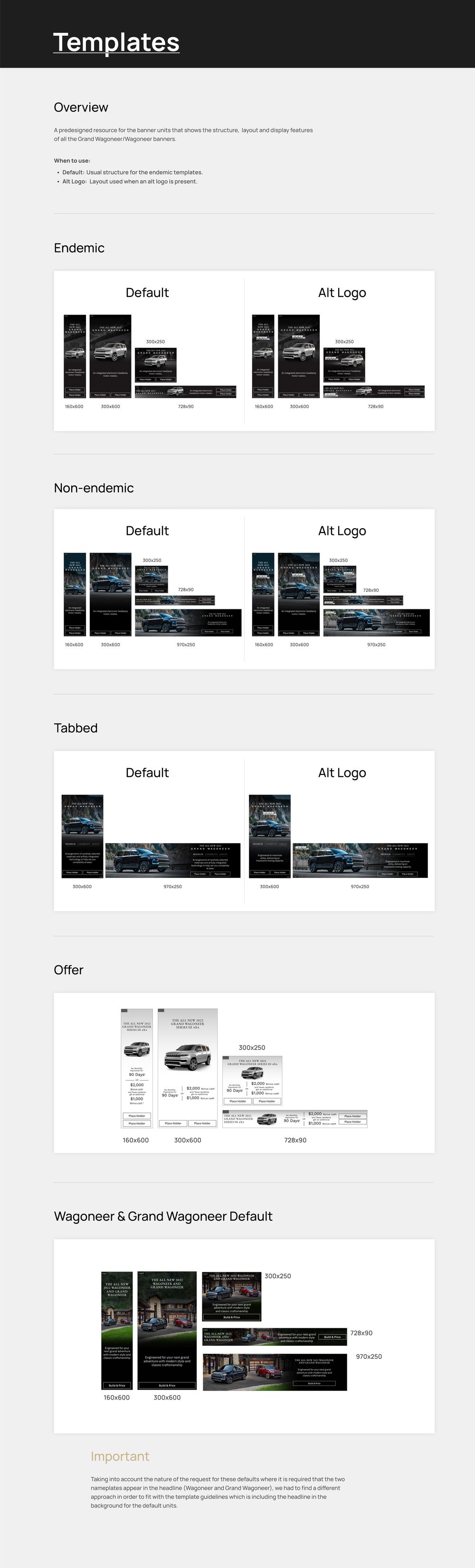

A complete system for the launch: five template families — Default, Endemic, Non‑endemic, Tabbed and Offer — across every tier and size, built on accessibility-validated color and type.
Un sistema completo para el lanzamiento: cinco familias de templates —Default, Endemic, Non‑endemic, Tabbed y Offer— para todos los tiers y tamaños, construidas sobre color y tipografía validados en accesibilidad.
Documentation for character limits, edge cases and measurements let design, development and QA produce and review units from the same source.
La documentación de límites de caracteres, casos borde y medidas permitió que diseño, desarrollo y QA produjeran y revisaran unidades desde una misma fuente.